
The mood in kitchen design is shifting fast, and the change starts on the worktop. Designers see bigger rooms, sleeker lines, and finishes that feel warm yet practical. While familiar stones fade, one countertop material is set to define the look. The latest kitchen trends point to lighter tones, softer sheens, and smarter edges. Because choices ripple through the whole room, homeowners now weigh style with daily use. The coming year rewards balance, versatility, and low-stress care.
Quartz Leads the Pack as the countertop material to watch
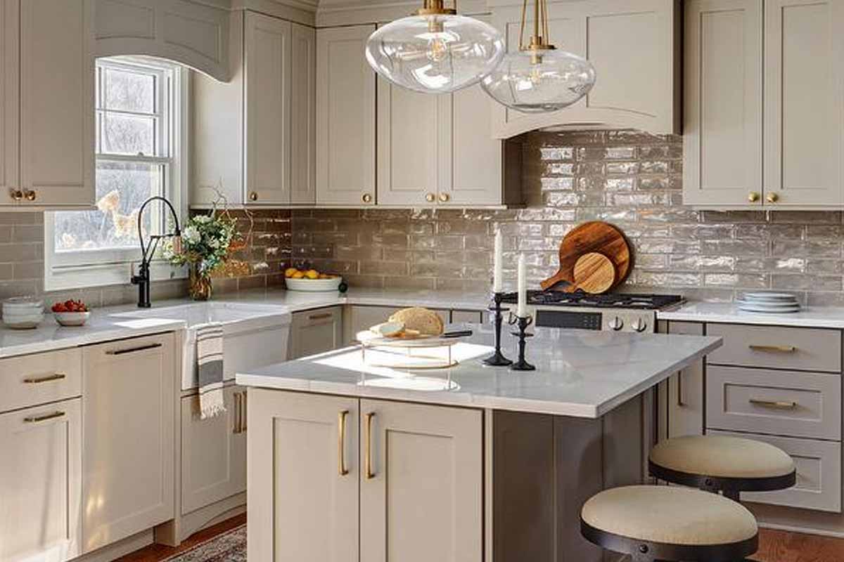
Quartz dominates because it pairs stone-like elegance with serious durability. Pros say it wins on stain resistance and easy upkeep, which matters in busy spaces. The NKBA surveyed 600-plus professionals and found quartz as the top pick. Designers also favor matte and honed finishes, which quartz handles beautifully with a refined glow.
Lighter surfaces feel fresh while darker cabinets ground the room. Many pair airy counters with walnut or white oak cabinetry, then add waterfall edges for flow. Edges go traditional when the look asks for restraint, yet waterfall lines rise in modern plans. Islands become design anchors, so the counter choice must carry the whole scene.
Preferences split on island color strategy, and that shapes quartz selection. Forty-four percent want matching counters, while 56% prefer contrast. Neutral palettes stay strong in kitchens, with 96% projecting whites, blacks, browns, and grays. Greens at 86% and blues at 78% add accent color, so quartz patterns slip in quietly.
Quartzite’s natural drama, refined for everyday resilience
Quartzite brings real-stone depth that reads elevated without feeling ornate. The report places it right behind quartz, as owners crave authenticity with fewer compromises. Its crisp veining sits well in pared-back rooms and keeps visual noise low. Because the face varies from slab to slab, selections feel personal, not cookie-cutter.
Designers tune quartzite to the year’s softer aesthetic. Honed surfaces mute glare and invite touch, while careful sealing manages stains. The stone’s cool undertones pair nicely with trending greens and blues. Since color moves subtly into backsplashes and accessories, the counter stays calm and composed.
The broader kitchen envelope now favors streamlined shapes. Transitional design leads at 72% and blends classic warmth with clean lines. Contemporary minimalism follows at 60%, which trims hardware and visual breaks. In that context, quartzite acts as a quiet hero countertop material, adding depth without weight or fuss.
Granite steps back in modern kitchens
Granite is still sturdy, yet it recedes as tastes evolve. Only 43% of pros see it as a major player for upcoming projects. Busy speckling can fight with the new simplicity, especially against flat-panel European doors. As rooms get larger, continuity matters, and granite often reads too active.
Today’s cabinets stretch floor to ceiling, and panel-ready appliances hide visual clutter. Those moves compress pattern variety and favor smoother expanses. White oak remains coveted for texture, with about half of pros naming it top. Walnut at 28% signals a shift darker, which makes many granites feel heavy.
Neutrals dominate, although accents grow bolder inside a controlled palette. Because 96% predict neutrals first, many aim for quiet counters that won’t tire. Greens and blues rise as secondary colorways, not as surface fields. In that layered plan, granite loses ground to a sleeker countertop material with steadier pattern.
Marble’s beauty meets high care and higher caution
Marble sits in a tricky place: iconic, yet delicate under real-life use. Only 26% of respondents expect it to rank as a leading choice. Etching from acids and patina from daily traffic demand vigilance. While some love the lived-in look, many homeowners want less worry and upkeep.
Honed marble lessens glare and can disguise micro-wear, yet it still needs care. The style story also tilts toward larger, multitasking kitchens with new zones. Beverage areas, expected in 85% of projects, increase risk from coffee and wine. That added exposure nudges buyers toward sturdier stones.
Designers weave color more subtly because the counter calls the tune. Accent paint, wallpaper, and islands allow personality without sacrificing function. Since modern doors and waterfall edges push a seamless look, marble can distract. Many therefore reserve it for a small moment, while the main countertop material stays robust.
Porcelain slabs are the silent countertop material rising
Large-format porcelain brings heat resistance, consistent faces, and minimal seams. Patterns emulate stone, concrete, or terrazzo while skipping the sealing routine. Fabricators wrap islands and create crisp waterfall edges that echo modern cabinetry. Because weight is lower than many stones, installation gets simpler in complex layouts.
Porcelain suits homes that juggle kids, pets, and frequent cooking. Spills wipe up without drama, and matte skins keep glare down. The visual still reads premium, especially when slabs run long. Since transitional rooms blend eras, porcelain’s chameleon finishes bridge classic and contemporary without clashing.
Color strategy favors porcelain’s controlled prints. Neutrals remain the base, while blue and green accents rotate in. Because the field stays calm, décor can change seasonally without rework. As kitchens expand into mudrooms, pet stations, and study niches, this low-maintenance countertop material supports the whole plan.
Why your next kitchen choice should favor calming resilience
Trends shift, but durable calm endures in busy homes. Choose surfaces that handle heat, spills, and daily knocks, then let accents change as tastes evolve. Lighter, honed finishes support sleek cabinetry and quiet lines, while smart edges shape flow around islands and bars. Plan for lifestyle zones without fear of stains or etching. With that lens, the right countertop material becomes a steady anchor. Elegant today, adaptable tomorrow, and ready for bigger, brighter kitchens built for real life.